Tuesday, June 29, 2010

#06 Memento for Late Uncle

My first client has returned for his second tattoo, despite his professions of being done with the pain. It's true, I guess. Tattoos are addicting.

He lost a dear uncle not long ago. He was a best friend and more to this family. He wanted this done in his memory.
I have seen various forms of this idea, but they're never cliché.

#05 Bull Horns

This was a new experience for me. A previous client's brother-in-law had a tattoo from years past done on his arm that he wanted filled in. No new design, just filling in!

The design itself was really cool. You can see the bull horns here, atop his forearm. The other side of the arm had a kind of wrist band image, making it look like he had a permanent leather and silver-studded band! But for whatever reason, his buddy never made the horns as detailed as the rest of it. So it's up to me.
The reason I say it's up to me, instead of it WAS, is because I'll need a second visit with this one. I got the black ink in there really well, as you can see. I love how the shading went in. But when I started using my blue ink, it only settled in a few places. His skin had already swollen, and it was either that that was our problem or my ink could not have been mixed thoroughly enough. He wanted these horns to be blue, so I kinda scratched my head. To protect the skin from too much at one time, he agreed to come back in a few weeks to get it finished.

This will be great when it's done.

Sunday, June 27, 2010

#04 Cross Design with a Drop of Blood


UPDATE: We got through the waiting period to touch this tattoo up at last! Above, you can see the final result. The other photo on this post is from the first visit, where the contrast is not as high and the blood drop is not completely filled in. Connecting the original lines with the shadows was a piece of cake. I'm glad I took it easy, but probably won't be as paranoid next time. Read on to see the original post:

My client asked for me to create a design for him this time, rather than use one that was already available. He asked for a cross design with a single drop of blood, and I was happy to oblige. I sketched out the design on paper before importing it into Adobe Illustrator to make sure that the design was symmetrical. After that, it was only a matter of deciding for sure how big the drop of blood should be and where it should be placed.

During the process, I was very careful not to go over any area more than necessary this time, so there will definitely be a small amount of touching up necessary where the lines meet the cast shadows inside the cross, as well as the drop of blood itself. I will not repeat the mistake I made on the 5-point shuriken where the client's over-worked skin created a scar.

The client and I are very happy with this one. I'm excited for the final touches in a few weeks.

Monday, June 21, 2010

#03 "Strength" Kanji - Solid Black

This is the same client as the shuriken (which I will be duplicating on his opposite peck soon enough). He requested a kanji the size of a piece of paper that says, "strength," which will be part of a set of three kanjis in a theme.


This represents the outline, plus a few areas that I chose to fill in with the smaller needle bit. Due to scheduling, we will be filling the design in completely at a future date.


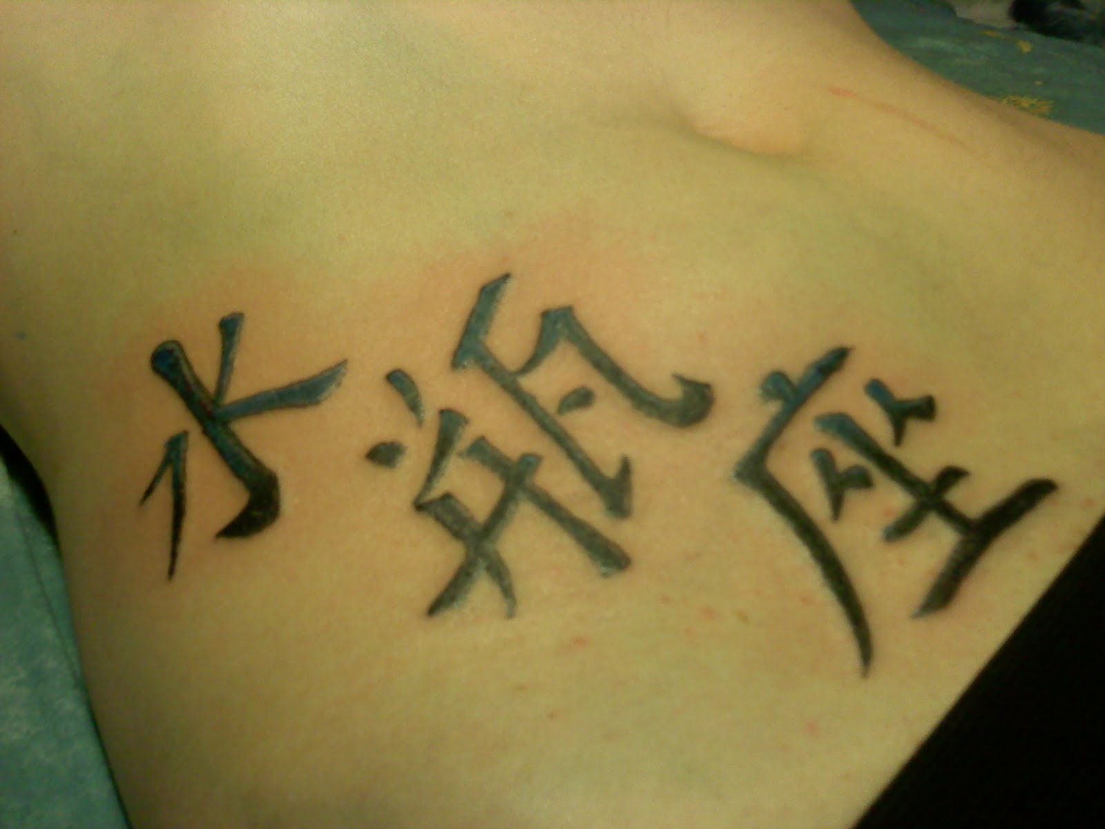
Here, you can see stage 2 of the design. I'm having a little frustration with the way the skin is taking the ink. I am thinking that when the needles have been going for a little while, the skin gets irritated and swells, making it more difficult for anything to penetrate it.But here is the first completed coating, which should be finalized in a few weeks, once this heals up.
I'm happy with the progress, but wish it was going faster.

#01 Aquarius Kanji (2nd visit to fill in the color)

Brought back, once again, is the Aquarius kanji set. This time, I had already brought the original outline to Gimp and colored it (see below). This was modeled after that color set, and we're all very proud of how it looks. I haven't put any color on skin before, so I'm hoping it heals the way it looks.

One issue I had with this was that the outline from a couple weeks ago has grown scar tissue that is much more difficult to tattoo this time around. You see the lines that almost look like they have a shine facing the right side of the photo? Well, those weren't intentional (although the client really likes it). New goal: complete every tattoo in one sitting.

Still, this kicks ass for my first completed tattoo.

Monday, June 14, 2010

#02 5-Pointed Shuriken (Cover-up)

A friend of mine got a tattoo done by his neighbor a while back. The artist used a home-made machine involving the motor of a CD player and a guitar string. This is what he came up with:

Looks a bit like a ball-point pen, huh? Well, I am trying to save the day by filling it in and getting the shape right. The problem with the size came along when we realized that his neighbor actually placed the reference shuriken on the skin and traced around it with the machine as though he were making a turkey picture for Thanksgiving (you know the hand-turkeys, right?). In so doing, this outline was way bigger than the weapon itself, and my design was therefore too small. Hopefully, with some shadows, we can make it work out without problems. Below is what I completed for the first run (there will be touch-ups to make the image darker).

Sunday, June 13, 2010

#01 Aquarius in Chinese Caligraphy

 This was my very first tattoo rendered on skin. The character on the left was the first, and was where I learned just how different skin if from the surfaces of oranges and grapefruits (which I used to practice with the tattoo machine). The client chose not to have me fill in the characters due to the pain. We'll see if he wants those mistakes corrected in a few weeks. (When they are filled, you will not be able to notice the mistakes.)