Tuesday, August 31, 2010
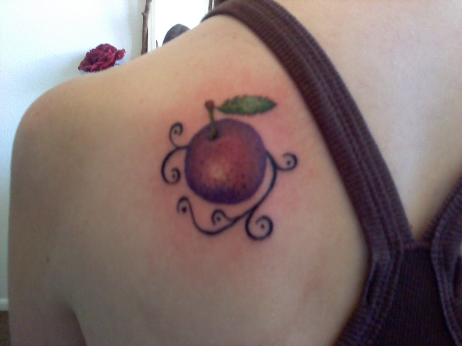
#22 Plum
This was unexpected, but exciting. My wife's cousin and his girlfriend were in town this week. Once they got in our apartment when we were hosting a get-together, she said she was interested in getting a tattoo. We were all expecting this to happen on their way back through Utah in a week or so, but after thinking about tattoos too much, she and I couldn't wait. You know, to get the tattoo done.
The photos didn't have that great of lighting, but it turned out real nice!
Sunday, August 22, 2010
#21 Leo Paw Print
This was a fun one. Despite how small it is in comparison to many of the past tattoos, this still took as long as some of the normal sized ones. Lots of fine-point shading on the flames.
We worked on this design together. She found the print online in solid black. I was curious as to whether she'd be interested in making the flame part look like real fire, instead of making it solid black. She jumped on it. Anyway, it turned out really nice! It's in a cute spot above her pant line and stands out really well.
Saturday, August 21, 2010
#07 Update - Finally got it colored in!
#07 is back. After several attempts at setting up our appointment, we were able to get together to complete this tattoo. When she got the black design, we had planned to eventually fill in the heart with purple and give the wings a blue highlight. This is looking even better now than before, in my opinion. It was cool to see a piece that I had done a few months ago still looking fantastic. I feel so accomplished.
Tuesday, August 10, 2010
#20 Metal Gear Solid "!"
Well, it has been an excellent road so far in learning to tattoo. You all have helped me along the way, whether by giving me your support or your skin to work on. I am happy with the way things have gone!
There is something that must be done by a tattoo artist before he/she is considered "legitimate," for lack of a better word. That task is to give him/herself a tattoo. I have now accomplished this task for the first time! Albeit a small tattoo, only 1x2.5 inches. it was still a fun experience. ....except for the pain, but that's the whole idea.
Anyway, this design is from the Metal Gear Solid games. The idea is that you are supposed to sneak past your enemies without being noticed. But if they pick up a sound you make or see your footprints, a giant blue/green "!" pops up above their head. If they actually see you, a big red "!" pops up right before they call for help and... you die or escape. I chose the green mostly because I like the color better, but it can mean many things. I'll leave it up to you to think of them, if you so wish.
You'll notice that they don't look precisely the same. Sometimes they come in less clear, and I thought it would look cooler if the lines were not all perfect as you can see in the example. I'm so happy about this!
There is something that must be done by a tattoo artist before he/she is considered "legitimate," for lack of a better word. That task is to give him/herself a tattoo. I have now accomplished this task for the first time! Albeit a small tattoo, only 1x2.5 inches. it was still a fun experience. ....except for the pain, but that's the whole idea.
Anyway, this design is from the Metal Gear Solid games. The idea is that you are supposed to sneak past your enemies without being noticed. But if they pick up a sound you make or see your footprints, a giant blue/green "!" pops up above their head. If they actually see you, a big red "!" pops up right before they call for help and... you die or escape. I chose the green mostly because I like the color better, but it can mean many things. I'll leave it up to you to think of them, if you so wish.
You'll notice that they don't look precisely the same. Sometimes they come in less clear, and I thought it would look cooler if the lines were not all perfect as you can see in the example. I'm so happy about this!
Sunday, August 8, 2010
#19 Remember Be Better
This design comes from the artist Kurt Halsey, and is important to the client. The original artwork was a little different, but the bats have been adapted a few times and changed to a few different styles. This was the one she liked the most. You can see from the images that we kept Halsey's original handwriting. Something I have never thought about bats: the way they hunt and seek things throughout the night is similar to seeking what you need in life, like love. Kind of cool!
A much larger tattoo than I'm used to. It took over 3 hours, but was well worth it. You can see the references below. We took a combination of the three. The tattoo down there is not mine, just used for color sampling.
Tuesday, August 3, 2010
#18 "BTB" Memorial with Ladybugs
This is a memorial tattoo of the client's late uncle, who she lost due to cancer. The letters are his initials, while the ladybugs represent his wife and two children. Each has the person's name next to it, but the photos didn't turn out very sharp, so you'll have to use the pattern that I'll post with this one.
Again, feet are a nuisance, but I'm getting better at both tattooing and holding the person down when necessary. Her friends tried helping, but could only do so much without actually holding her foot like I was.
Saturday, July 31, 2010
#17 Pentagram and Rose
Once in a while, you get a design that you want to make sure that the client knows about before going ahead and starting on it. I figured this was one. However, she knows her stuff and understands the meaning behind a pentagram even better than I did, so we went ahead and did it.
I wish I had a photo of the shading that went on before the color. The textures on the vines look really great, but the thick color is blocking a lot of it. It will all show up when it's healed properly, however. Even if it were stuck like this, it would still look really nice.
Friday, July 30, 2010
#16 Hops and Barley on Upper Chest
My word of advice to all who can heed me, "Don't get a tattoo on thin skin unless you're sure you can take it." This guy could, but it nearly sent his fist in my face. Not really, but he was making more noise than anyone else so far. The very center of the chest is apparently an "are you sure?" area. The inking went very well. When I started shading, he was impressed with how realistic I was getting. He said that if he knew I was as skilled as I am, he would have planned for me to do more complex designs!
The client brews his own beer (which made the tip fun, *belch*), and it's an important part of who he is. He was tell you countless types of brews and their ingredients. He said he's even replicated a beer type by tasting it, making note of which yeasts and plants were used to create it, and made his own with excellent results. Seriously, it's an art form that I never knew about. He has plans to take this tattoo to further places on his upper body, but wanted to start with representing the barley and hops plants that are so important to the beer-brewing process.
Ending note: I got another, "This is so much better than I expected," remark from this one. I'm glad that the gracious people who are donating their skin to my learning process are happy with the results. I wouldn't have it any other way.
Wednesday, July 28, 2010
#15 Shooting Star
This client is a friend of mine. She wanted a cute little shooting star just below the bikini line on the front of her leg. I was a bit concerned with the size of the tattoo, as it's smaller than anything I've done before. Then, as I got started, I realized that even though the overall size is smaller, the fine details weren't any smaller than on some other tattoos so far. I like how fast it went, although I was very picky when making sure the lines were perfect.
Monday, July 26, 2010
#14 "Micah" Fix-up
Such a cute couple. This client and her husband had their one year anniversary about a month or so ago and she had decided to get her sweetheart's name tattooed on her as a gift to mark the occasion. The original tattoo was about a half inch off center on her lower back, and she was also concerned that the design itself was left-heavy. She came to me with a great design for two butterflies that we applied, as well as a flower to fill in the center. I also went inside the lettering and made the shading more gradual and natural-looking. I was happy to work on this one and the client is very happy to have it fixed!
Subscribe to:
Posts (Atom)


